


Gamification has long been the "darling" of the consulting scene. In various projects, attempts were made to merge game theories and business applications. The basic conviction was that if you only implement the right game elements in a business application, then the joy of playing is created while achieving specific goals. In this way, even repetitive work should be fun. We thought that any application could be transformed into a game by adding badges, points and leaderboards. It was the heyday of programmes like "Foursquare". Everything was turned into a game.
But it turns out; it's not that simple. Most of these gamified business applications produced, to put it kindly, no results. In some projects, they even had the opposite effect.
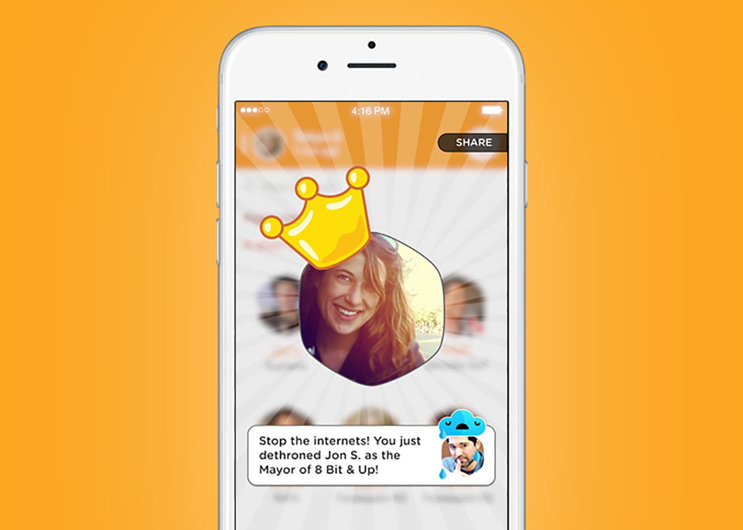
The big companies in the industry soon began to remove the gamification elements from their applications. Foursquare, one of the poster children of the industry, packed all the gamification elements into its own application called "Swarm". However, this was never as relevant and popular as the original Foursquare app. Another manufacturer that was repeatedly used as a role model was "Stack Overflow". A system of points, ratings and badges. This system was designed to encourage users to actively participate in the forum-like application. Which the users did very diligently. In 2021, Stack Overflow was sold for US$ 1.8 billion. But even in this case; before the sale, Stack Overflow explained that their success had nothing to do with points and badges.
Today, every "gamification company" and every "gamification consultant" would probably admit that gamification was not the panacea that was expected around ten years ago.

Foursquare Swarm – Source: wirefly.com
What went wrong
In retrospect, four factors can be recognised (Sergio Nouvel).
The concept of the "game" itself. The term "gamification" in itself conveys the idea that everything should behave like a game. Product managers and consultants have taken "gamification" literally. They have gamified processes and behaviour and created silly games in the process.
The misuse of points, badges and leaderboards. Product designers have started attaching virtual points, or currencies, to all sorts of things. Always under the premise that if you offer people something to collect, they will try to collect it no matter what.
Displacement of rewards. It has been proven that offering rewards of any kind for behaviour that should be spontaneous puts people into "transaction mode", which changes the original motivational system and makes them less motivated than before. This also applies to virtual currencies and rewards.
A patronising tone. In order to keep users motivated, a tone was often chosen that was intended to be congratulatory and cheerful. After initial use, however, this tone came across as patronising and "petty" instead of "user-friendly". A system that assumes that you have to be constantly led by the hand makes you feel somehow handicapped (for example, Microsoft Office’s Clippy). Nobody likes to be treated like a child.
Nevertheless, gamification as a design approach has brought very valuable insights and methods to product and system design that, when utilised, can make a difference to the user experience.
Gamification used correctly
Of course, the "gamification" design approach has not been forgotten. It is of course still used today. Let's take a look at two examples where you can observe game mechanisms (in the context of "behaviour change design") that achieve pretty good results.
Duolingo: Maintaining motivation for something you are already motivated for.
Duolingo managed to motivate the user in an entertaining way for something the user always wanted to learn: Languages. We are used to learning in a boring way through courses, books and tests through primary school.
Duolingo is better because it tackles a difficult subject (learning a new language) with a light approach and gives the user/student a sense of progress. By going through individual levels, you get an objective measure of your progress. Passing these levels is just the right level of difficulty. You usually make a few mistakes, which in turn reinforces the feeling of unpredictability.
This is the key to keeping the user/student motivated, but of course none of this would work if you didn't want to learn the languages in the first place.

Duolingo
Trello: Motivation through visualisation of progress and performance
Most task manager applications make you feel overwhelmed. They constantly remind you of the things you haven't done yet. The more tasks you pile up, the less likely you are to complete them.
Trello is a notable exception. Per se, Trello is a typical to-do list system. Like the Kanban method from which it is inspired, Trello assumes that tasks can have different states and that the binary "not done" approach is not useful for most purposes. Self-definable intermediate states allow you to differentiate between started, waiting and completed tasks. This is crucial because there can be many phases between starting and finishing a task. A binary task list does not reflect this. As a result, most tasks in such an app are always unfinished, even though you are working on them.
The tasks are dragged from one pile to another like cards. Dragging and dropping gives you the feeling that you are actually making progress on a task.
But most importantly, you have a pile of cards, so you can always see what has already been achieved. This motivates you to achieve more. You don't need a badge as a reward. It is enough to see that the task is progressing. Trello is a successful example because it recognises that the things you have done are just as important as the things you haven't done yet.

What can we learn from the past
Some useful insights for the design of user experiences can be derived from these examples. The focus here is particularly on the design of content for performance management systems such as GRAVITY.
1: Make users feel smarter. Improve the tasks the user already has to do by removing obstacles and barriers. Lead users by the hand the first time and then let them do it themselves. Avoid a patronising tone and keep congratulations to a minimum.
2: Enable discovery of advanced features. When you hide advanced features, you make it easier for beginners and give power users a sense of accomplishment and exclusivity.
3: Design for flow. Avoid interruptions. Allow users to fully immerse themselves in a task. Provide discrete callouts and notifications.
4: Let users define their standards for progress. People have very different ideas of "better". Don't impose your rules on them. Rather, give users the opportunity to set their own milestones and act as a measuring tool rather than a coach.

Embrace the digital adoption platform of tomorrow - GRAVITY
Subscribe for Front-Row Seats!
Join Our Monthly Author Call – Stay Ahead of the Curve with the Latest Trends!

Christoph Müller
For years I used corporate Intranets in the workplace, experiencing firsthand that traditional learning formats for IT rollouts and employee onboarding do not work. I developed GRAVITY software to tackle this challenge. Employees are happier because learning is simple and effective; businesses are happier because their IT rollouts are successful and cost a lot less than before.

